Archive for the ‘Awards & Press’ Category
A Look at the Visual Effects Behind Mastering Lighting
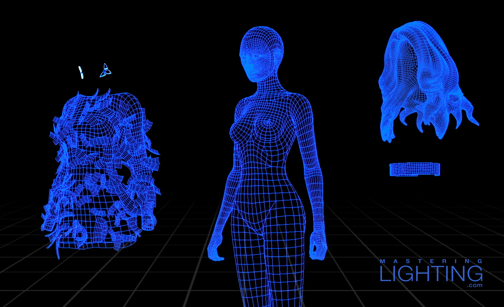
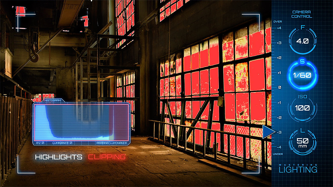
I’m excited to release this 8-minute video documenting the making of Mastering Lighting. It showcases the incredible amount of teamwork that went into creating a learning experience that didn’t suffer from the usual tutorial boredom. It’s also a fun look at the challenges we faced trying to squeeze PhotoKamp into an easily-distributable format, including scanning a model in 3D, taking you to my favorite locations virtually, and putting the viewer inside my head for a first-person POV on set.
We hired more than a dozen visual effects artists in five countries to help us build the warehouse, the Aryn model, and a full library of lights and camera gear. Being new to VFX, I was naive at best, and I would have been in way over my head if not for the guidance and contributions of good friend and VFX supervisor Raffael Dickreuter.
Dickreuter gave us the blueprint for creating a mini-VFX house within SlickforceStudio, and together we spent endless hours building render farms and network servers, programming camera moves, and adjusting lighting and texturing from the various artists. It’s safe to say that without Raff I’d still be working on this today.
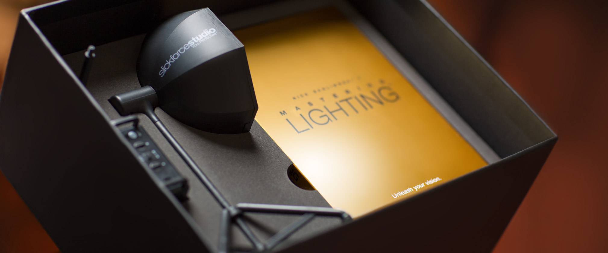
If you haven’t checked out Mastering Lighting yet, you can learn all about it right here. SlickforceSystem.com is offering a Fall promotion for $30 and free U.S. Shipping, enter code MLFALL30 at checkout. Also, for a limited time you can order additional SlickforceSoftlight’s with your order.
INTERVIEW: Lighting Like a Comic Book for SlickforceGirl
This is an excerpt from a recent interview I did with Rebecca Britt for Fstoppers. Read the full interview here.
Fstoppers/Rebecca Britt: I’m always fascinated when a photographer uses their talents for a greater cause than themselves. SlickforceGirl is a commercial and creative pinup brand that helps raise awareness for women’s causes and breast cancer. I recently had the opportunity to review creator Nick Saglimbeni’s Mastering Lighting series, and I wanted to sit with Nick to discuss his SlickforceGirl campaign and how he uses the techniques taught in Mastering Lighting within the campaign.
FS: I’ve been a fan of your SlickforceGirl brand for a couple of years now. Can you explain to our readers what started the idea of a SlickforceGirl?
Nick Saglimbeni: I originally created SlickforceGirl because I found myself at a crossroads in my art. My career first gained traction in the urban glamour market, an arena which boasts huge fan followings but very little recognition outside of that world. The models are gorgeous and every bit as talented as — and in some cases, more hard-working than — their “mainstream” counterparts, but because they are curvy, or ethnic, or short, they are historically limited to roles such as “music video girls”.
I’ve always seen color, curves and shape as assets rather than hindrances, and I think I instinctively knew how to photograph these women in a way that was different from what had been done before in that world. I wanted to create a diverse universe full of strong female characters for a new generation that isn’t used to every character just being tall, skinny and white.
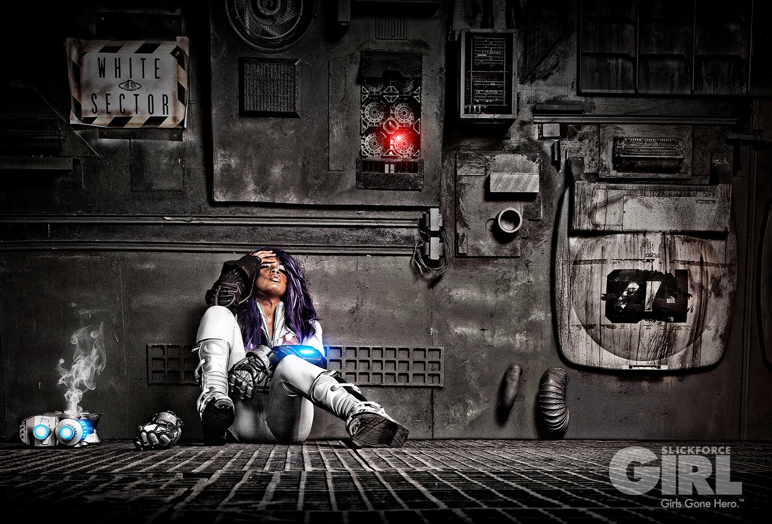
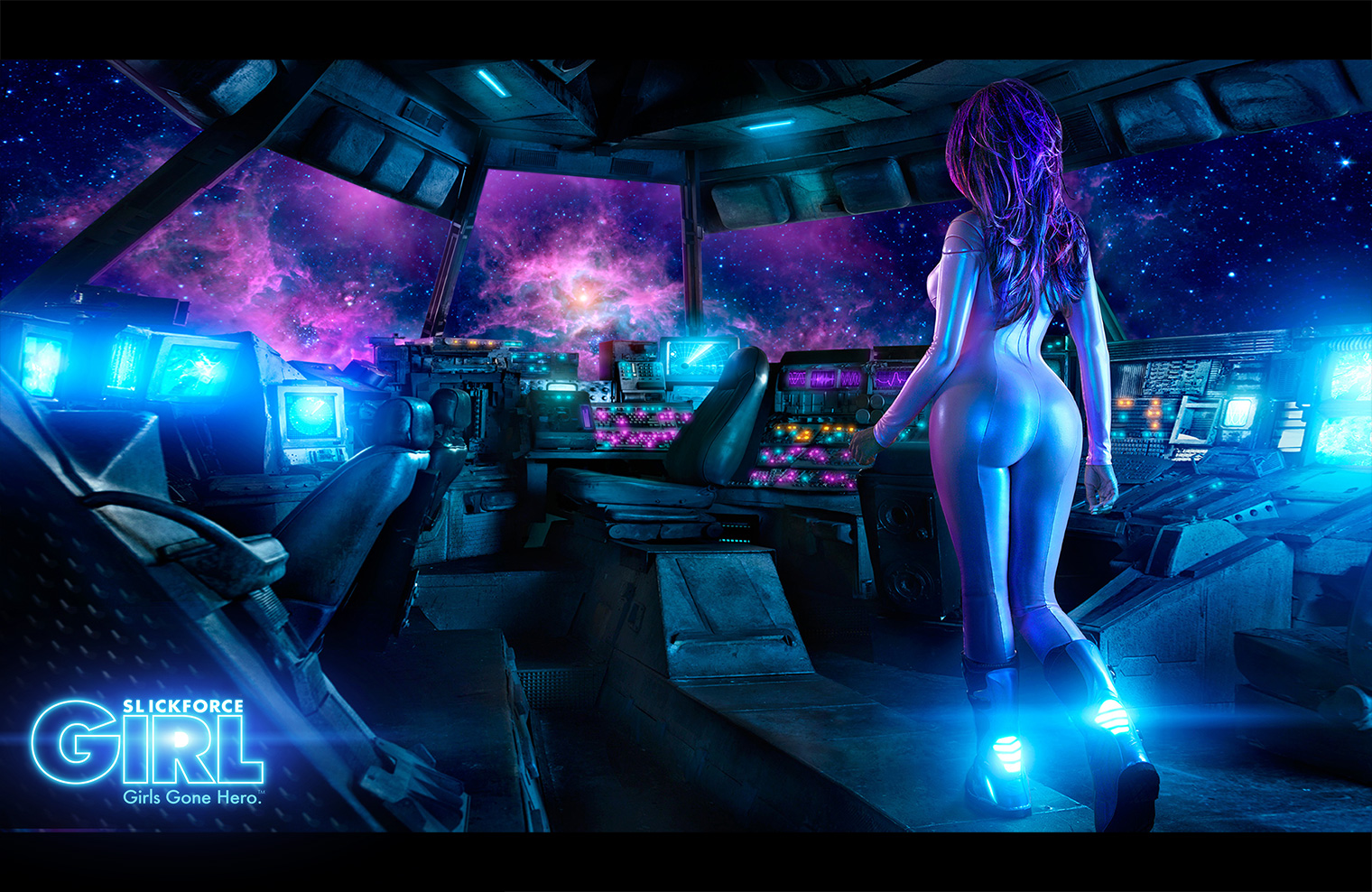
FS: The scale of your Astronaut Vanessa character looks massive, it looks more like a movie. How did you choose your location and why?
NS: Visually speaking, Vanessa’s story was the most logistically difficult to shoot, but it’s also the most excited I’ve ever been on set. It felt like we were making a feature film, and we all turned into producers trying to find ways to get feature-film production value into a photo shoot budget. I’ll never understand this new era of just compositing everything onto a stock photo background. Being on location is at least half of the fun, and it changes the energy of the shoot dramatically.
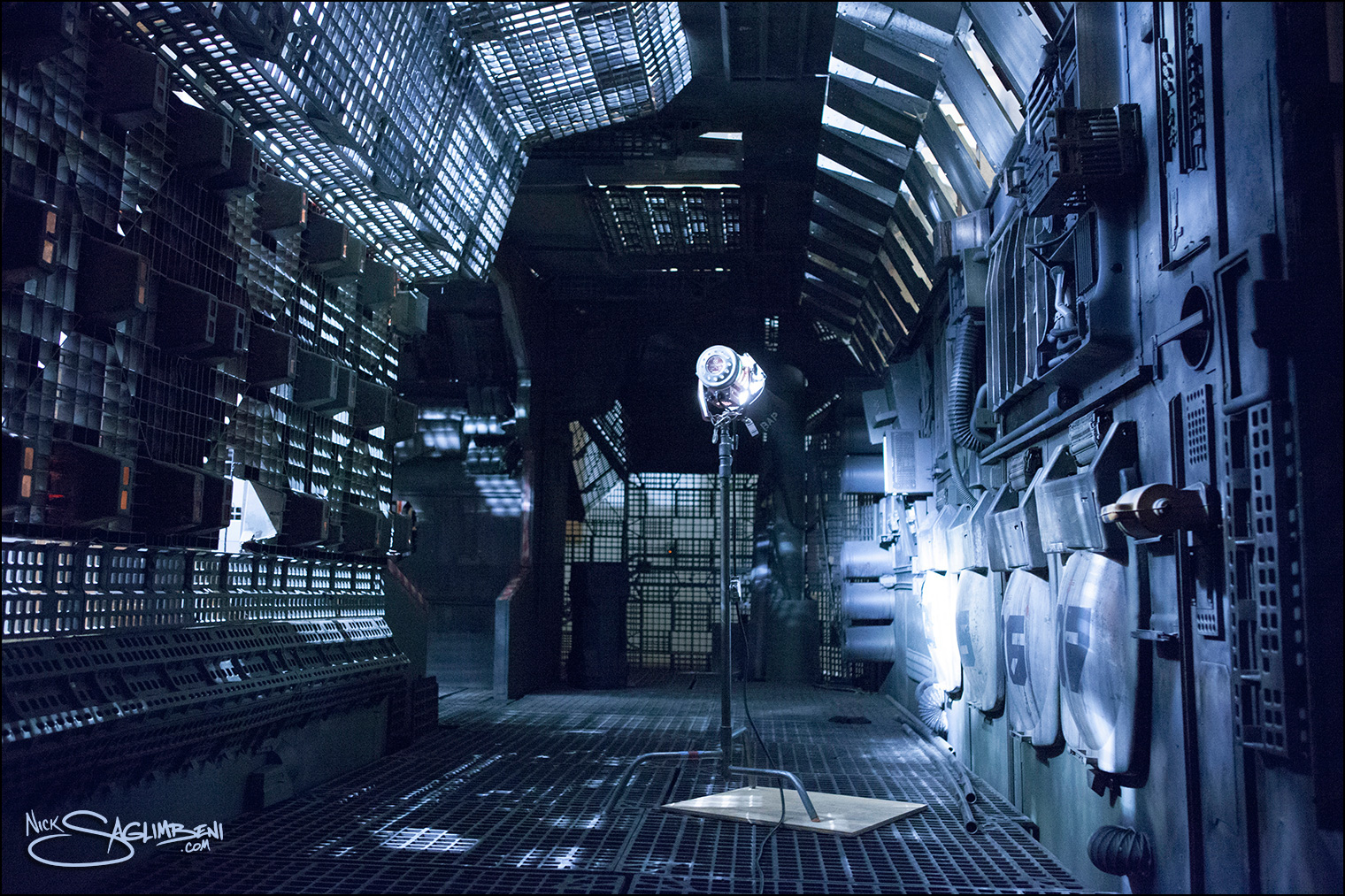
We found a huge spaceship set that was built on a sound stage for a sci-fi movie, and they hadn’t broken it down yet. It was architecturally perfect, but aesthetically very gray and drab. I wanted a very stylized color palette for our pop version of deep space, similar to the bioluminescent scenes in James Cameron’s Avatar.
One of the ways we achieved this was through costume and glam. We originally planned on putting model Vanessa Veasley in an actual NASA Mercury suit, but quickly discovered they were so bulky that it was impossible to shoot anything even remotely sexy. So we had her space suit custom-made, and used fabrics with a reflective sheen to capture the “monitor glow” around the spaceship.
FS: How did you approach the lighting for this concept?
NS: For the cockpit scene, we had two lighting motivators — the interior glow from the monitors and bridge controls, and the exterior glow from the stars. There’s really no manual on lighting for outer space, so I looked at old American Cinematographer articles on Armageddon and Terminator 2 for inspiration.
I didn’t want to deal with the spill from green-screen, so we built two 12×12 white griffolyns outside the cockpit window and fired 4 heads on two 2400w/s packs into them. Compositing is much easier in stills than in motion-picture, so you can use whatever color you want to end up with. We then created “nebula hits” by pointing a couple of strips and softboxes with pink and purple gels directly at Vanessa. The trick with making outer space ambience look believable is to let some of the scene fall completely to black, so we were very careful not to overlight the cramped space. For the interior cockpit glow, we placed small double-silked strip lights with steel blue party gels around the ship and behind camera.
This scene was shot at ISO 100 on a 50mm lens (medium format). Even though we were wide, the biggest challenge is carrying the depth of field at that speed because theoretically both Vanessa and “the stars” needed to be in focus. Ultimately, we were able to get the light barely to an F4/5.6 split, and then I set the lens to F8 and let it underexpose a stop-and-a-half, except for a few highlights on her suit. It would have taken too much power to get our ambience higher, and if there were really stars outside that window, the light that reached the ship would be perfectly believable a few stops under key. Also, blues and purples saturate better at a darker luminance than warm colors so it ended up working in our favor.
(Read the complete interview on Fstoppers here.)
— My thanks to Rebecca and the Fstoppers team for a great interview!
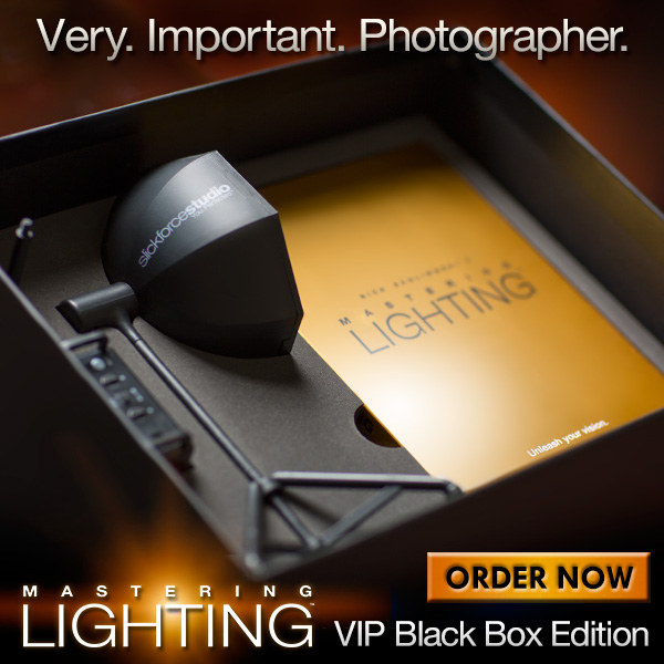
Mastering Lighting – News, Reviews & Previews
After spending two long years and countless hours in a seemingly-forgotten corner of Los Angeles putting together our latest tutorial, it has been an absolute thrill hearing from so many of you about Mastering Lighting: Volume One. For those still curious, here’s a look at the first chapter of the series.
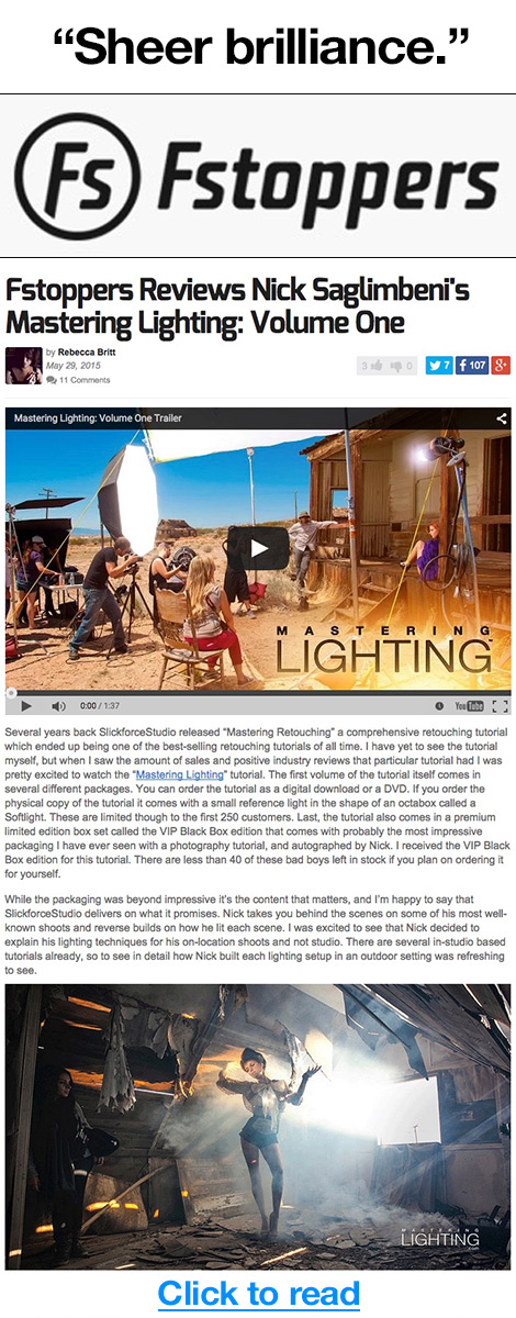
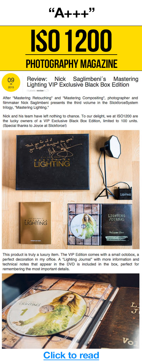
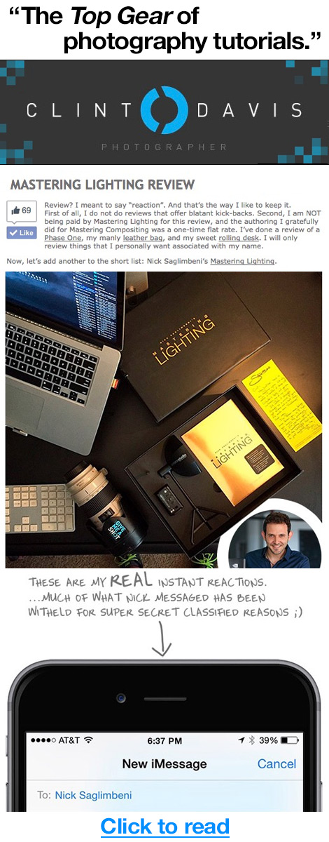
Fortunately, some pretty big critics seem to be in agreement with your positive comments, and Mastering Lighting has been getting rave reviews from these incredible photography sites. (Click images below to read the full reviews.)
 |
 |
 |
I am also proud to announce the simultaneous release of two additional language versions. Mastering Lighting: Volume One has been meticulously translated into German and Spanish, by photographers Stefan Rasch and Adrian Orozco respectively. For those viewers who want the best of both worlds, the SlickforceStore is offering a combo bundle which features the German or Spanish download and the English Box Set (Standard or VIP Edition). Previews of each language are below. Click here for more information and to see all language options in our store.
And finally, by popular request, we’ve now introduced VIP Box Set Trilogy combos, allowing you to complete your SlickforceSystem library collection while adding the convenience of the downloads. Each trilogy set includes Mastering Lighting: Volume One, Mastering Retouching (Levels 1-7) and Mastering Compositing (Levels 1-5). Compare all options here.
Thank you for continuing to send your feedback, it is incredibly helpful in our quest to continually improve our learning series’!
WMB 3D’s Warehouse Wonderland Makes Sony World Photo 3D Finals!
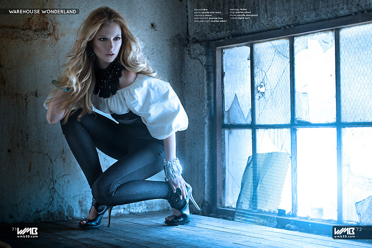
Breakthrough.
This morning, we were notified that an image from our 3D fashion feature, Warehouse Wonderland, made the finals at the Sony World Photo Awards in the 3D Category. The piece, entitled “Breakthrough,” was featured in Issue 2 of WMB 3D: World’s Most Beautiful in 2012.
This is the second year we’ve been recognized by Sony and the WPO. In 2012, we won the Grand Prize in 3D for our fashion piece, Nuclear Summer, also shot for WMB 3D (See pics from last year’s award win here.) It is an honor to be in such esteemed company as our fellow nominees, and it is a personal thrill for me to see our wonderful art house get recognized for its landmark achievements in 3D photography.
I also must thank our team for helping me create this beautiful image. Fashion model Aryn Livingston graciously allowed me to dirty her up in the industrial warehouse. Genius stylist Monica Rose wowed us all again with her out-of-this-world wardrobe styling. Hair stylist Gio Campora and make-up artist Gaby Ramos Torell—the same glam squad that brought you our globally-reknowned desert shoot with Bollywood superstar Mallika Sherawat, returned to lend their enormous talents and create their signature brand of magic. My thanks to WMB 3D Executive Publisher Howard Misle and the WMB staff, and to the entire Saglimbeni3D technical team, including lead engineer German Pinchevsky, post-production supervisor Joyce Park, production coordinator Kevin Savarese, and art director Clint Davis.
Read more about our Sony WPO nomination on FStoppers.com, and watch the making of Warehouse Wonderland below!
WMB 3D: 02 Warehouse Wonderland High Fashion from Nick Saglimbeni on Vimeo.
Triple Threat in the UK
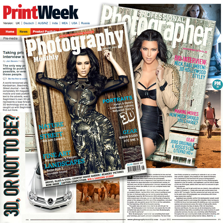
This summer, Saglimbeni3D made a big splash in the UK, thanks to a front-page PrintWeek story and cover features in two of England’s leading photo publications: Professional Photographer and Photography Monthly.
All three features focused on our advances in 3D photography. UK audiences have embraced the progressive art form, and to their credit, they also are aren’t afraid to ask the tough questions. Journalist Jon Severs interviewed me in London while I was in town for the Sony World Photography Awards. While most of our American press features have been focused on which celebrities we are shooting, Jon’s hour-plus-long interview covered so many intricacies of the 3D photo universe—both technical and artistic—that I was actually caught a bit off guard, but happily so.
My sincerest thanks to Jon for his in-depth interview and articulate writing, and also to Adam Scorey at Archant Imaging. As an artist passionate about 3D, it is exciting to have the opportunity to talk about the science behind the art and the future of the genre, especially to such an interested and curious audience.
Get your copies of Photography Monthly (August 2012) and Professional Photographer (September 2012) at Barnes & Noble and on newsstands now. See a preview on Jon’s blog here.
Read the PrintWeek feature here.
Blogger & photographer Jade Lisa also wrote a wonderful piece on my traditional (2D) photography. I’ve received many positive letters from women about this interview, and I have to give Jade credit for approaching my work from a refreshing female perspective. See it here.
Sony Brings Saglimbeni3D to São Paulo for PhotoImage Brazil
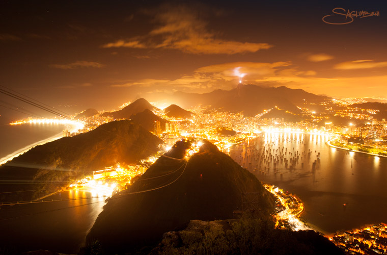
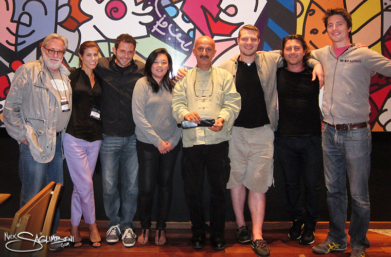
Recently, Sony invited me to join a panel of speakers at PhotoImage Brazil. The PhotoImage convention is the largest photography and image expo in Latin America, showcasing top photography-related gear and unveiling innovative new technologies. Over 30,000 attendees turned out at this year’s show, held August 14-16 in São Paulo.
Saglimbeni3D post-production supervisor Joyce Park joined me on our Brazilian adventure, and we gave two presentations at the Sony booth on the latest advances in 3D photography. I had the pleasure of meeting and working with a brilliant group of photographers, including digital pioneer Pedro Meyer, National Geographic photojournalist Reza Deghati, and UK-based rising-stars Palmer & Pavel and Andrew Scriven. We also met many aspiring photographers in the audience, several of whom came out to see us after we announced our appearance on Twitter and Facebook.
After the convention ended, Joyce and I headed north to Rio de Janeiro for some beach time and to see the sights. I fell completely in love with the city within minutes of arrival. Beaches surrounded by lush jungles are my version of paradise, and the preponderance of fruit markets and natural juice bars made me feel instantly at home. We walked the beaches of Copacabana and Ipanema on Friday night only to discover what a physically active city Rio is: the bike lanes were filled with night-joggers and rollerbladers, and the sand was packed with locals running obstacle courses, slacklining (you’ve got to see it to believe it) and playing midnight beach volleyball. On Saturday we made our way to the top of Sugarloaf mountain to take in the jaw-dropping views of the coast. Far too short a trip for such a vast and beautiful country, but a perfect introduction to all that Brazil has to offer.
My sincerest thanks go out to Sony Brasil and creative director Astrid Merget of the World Photography Organization for inviting us to spend time amongst such esteemed company. I will never forget the sights we saw, the friendships we made, nor the wisdom we picked up along the way. I also cannot wait to get back to Rio. Vou sentir saudade, Brasil!
CREDITS: Photos by Nick Saglimbeni & Joyce Park
TOP A: The stunning view of Rio from atop Sugarloaf mountain. Note the Cristo Rendentor (Christ the Redeemer) statue illuminating the sky from the mountaintop in the distance.
TOP B: (Left to right) Pedro Meyer, Astrid Merget, Nick Saglimbeni, Joyce Park, Reza Deghati, Jared Palmer, Pavel Vizner, Andrew Scriven
2012 NVIDIA 3D Vision Photo Champion Award

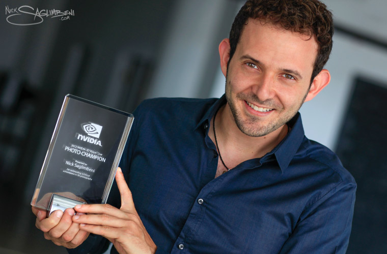
The wonderful folks at NVIDIA 3D Vision Live surprised me last week by awarding me the 2012 Photo Champion award. This was the culmination of much support from our fans as well as two previous monthly awards on the 3D Vision site. It’s an honor to receive this award, and my deepest thanks go out to everyone involved. (Detailed thank-you’s below.)
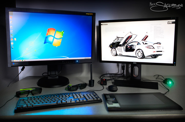
We’ve been working with NVIDIA to roll out some of the world’s most ambitious 3D content, and as part of this new venture they encouraged me to look at our work on some of their high-end 3D rendering hardware. Now, as most of you know, I’m a Mac lover through and through, but one of Apple’s few major shortcomings is its lack of 3D support. So after a week-long test-drive of NVIDIA’s butt-kicking Quadro 5000 graphics card, I decided to make a foray back into the Windows world and build SlickforceStudio a new 3D PC workstation. After reading many reviews and speaking with several friends in both the visual effects and 3D worlds, here’s the setup I opted for (pictured below):
Eizo ColorEdge CG275W 27″ LCD display (left)
BenQ XL2420T 24″ 3D LED display with 3D Vision Lightboost (right)
NVIDIA Quadro 5000 2.5GB Graphics Card
NVIDIA 3D Vision Pro hub & active-shutter glasses system
Wacom Intuos 4 Medium tablet
First, let me say that this Quadro 5000 card is a BEAST. At an inch thick and with built-in fan big enough to cool a small tower, it takes up two bays on your machine and looks like no graphics card I have ever seen. That said, it’s also the best visual experience I’ve ever had on a PC. Rendering out both 3D video and stills and fast and effortless, once you get used to the new workflow. The Eizo display is absolutely gorgeous and showcases some of the richest color I’ve ever seen. The BenQ 3D display with 3D Vision with Lightboost is awesomely bright, which 3D connoisseurs know is almost always a problem with shutter-glasses systems, because you lose half the light in each eye. Not here. The 3D is absolutely beautiful and perfectly luminous (and unlike iPads using red-cyan glasses you retain full color information.)
As a test, we converted a portion of WMB 3D to be viewed on the 3DVision Pro system, and I can honestly say our 3D images have never looked better. Clint Davis‘ layouts jumped off the page, and it made me yearn for the day when everyone can view our content in full-color 3D.
My sincerest thanks go out to Steve Klett and Sean Kilibride at NVIDIA, and also to Thomas Gadbois at Eizo for helping us put this fantastic system together. I also must thank the amazing Saglimbeni3D team who continues to create and innovate in a new world with never-enough resources: Post-production supervisor Joyce Park, Director of Operations Kevin Savarese, lead engineer German Pinchevsky, photographer Christian Arias—this would only be a dream without you all.
For me, the NVIDIA 3D Vision Champion award is another landmark step in showing the world the undiscovered beauty of 3D photography, and I am grateful to all who have supported us in our journey.
For more on the 2012 Photo Champion Award, visit NVIDIA’s 3D Vision Live site here.

Nuclear Summer wins 3D Grand Prize at Sony World Photography Awards
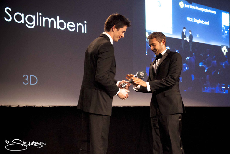
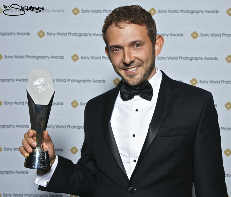
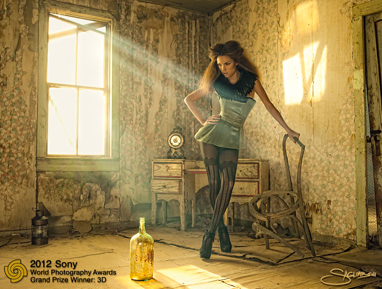
On Thursday evening, April 26, the Sony World Photography Awards were held in London, part of the month-long World Photo London event at Somerset House. My fashion piece Nuclear Summer (featured above) was nominated in their 3D category.
I always appreciate a good excuse to travel to one of my favorite cities, so I headed to London on Tuesday to show support for both the event and our nomination. All of the nominees’ work for all of the categories was displayed at Somerset House, in a remarkable gallery exhibition. It was thrilling to see so much amazing work from so many talented and varied artists. (My particular favorite was Mitch Dobrowner’s stunning black-and-white storm photography, which ultimately won the L’Iris D’or prize. Check out his site here.)
On the night of the awards show, the photographers appeared one-by-one in black tie—a stark contrast to the American photography award shows I’ve attended–and celebrated each other victories and work throughout the night. I was honored to receive the Grand Prize in 3D, mostly because it stood as a testament to the hard work of my brilliant Saglimbeni3D team, who has spent the last two years in the trenches with me, developing new 3D cameras and post-production technologies and launching 3D projects such as WMB 3D: World’s Most Beautiful. I’d especially like to thank Saglimbeni3D post-production supervisor Joyce Park, director of operations Kevin Savarese and the entire production team at Slickforce Studio.
My sincerest thanks also go out to Sony and the good people at the World Photography Organization for recognizing our work. We look forward to producing many more exciting 3D projects in the future.
Press photos © 2012 HoneybunnPhotography, Robert Leslie, Duc Le
Nuclear Summer © 2011 Nick Saglimbeni
WMB 3D Issue 2 Gabrielle Union cover released!
Special thanks to Holly Shakoor and Lauren Thorpe at 42West for helping us coordinate this exciting shoot!
Photography by Nick Saglimbeni
Makeup by Motoko Honjo
Hair by Larry Sims
Styling by Caley Lawson
WMB 3D Premiere Issue Launch Event
After a year of top secret photoshoots and long nights in the studio, we finally launched WMB 3D with a bang at Drai’s in Hollywood. We were honored to have so many of our celebrity friends come out to support us at our premiere issue launch event, including cover girl and guest-of-honor Kim Kardashian. As the crowd looked on, we presented Kim with framed 2D & 3D magazine covers and her very own blinged-out pair of rhinestone 3D glasses! The party lasted until the wee hours until the crew finally passed out, grateful to have been able to take our place in history as the world’s first 3D magazine. It was a night to remember, we thank all those who came out to support!


