INTERVIEW: Lighting Like a Comic Book for SlickforceGirl
This is an excerpt from a recent interview I did with Rebecca Britt for Fstoppers. Read the full interview here.
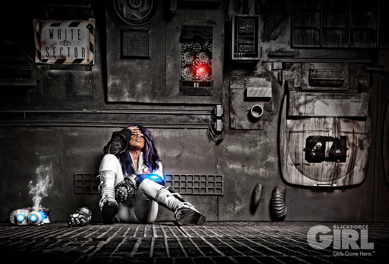
Fstoppers/Rebecca Britt: I’m always fascinated when a photographer uses their talents for a greater cause than themselves. SlickforceGirl is a commercial and creative pinup brand that helps raise awareness for women’s causes and breast cancer. I recently had the opportunity to review creator Nick Saglimbeni’s Mastering Lighting series, and I wanted to sit with Nick to discuss his SlickforceGirl campaign and how he uses the techniques taught in Mastering Lighting within the campaign.
FS: I’ve been a fan of your SlickforceGirl brand for a couple of years now. Can you explain to our readers what started the idea of a SlickforceGirl?
Nick Saglimbeni: I originally created SlickforceGirl because I found myself at a crossroads in my art. My career first gained traction in the urban glamour market, an arena which boasts huge fan followings but very little recognition outside of that world. The models are gorgeous and every bit as talented as — and in some cases, more hard-working than — their “mainstream” counterparts, but because they are curvy, or ethnic, or short, they are historically limited to roles such as “music video girls”.
I’ve always seen color, curves and shape as assets rather than hindrances, and I think I instinctively knew how to photograph these women in a way that was different from what had been done before in that world. I wanted to create a diverse universe full of strong female characters for a new generation that isn’t used to every character just being tall, skinny and white.
FS: The scale of your Astronaut Vanessa character looks massive, it looks more like a movie. How did you choose your location and why?
NS: Visually speaking, Vanessa’s story was the most logistically difficult to shoot, but it’s also the most excited I’ve ever been on set. It felt like we were making a feature film, and we all turned into producers trying to find ways to get feature-film production value into a photo shoot budget. I’ll never understand this new era of just compositing everything onto a stock photo background. Being on location is at least half of the fun, and it changes the energy of the shoot dramatically.
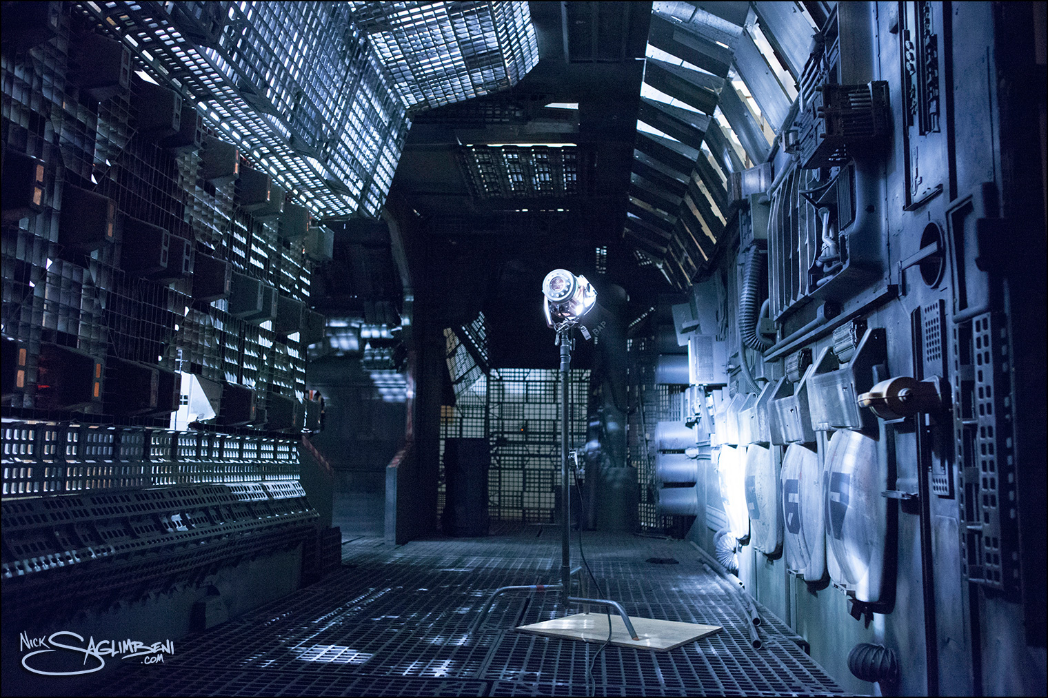
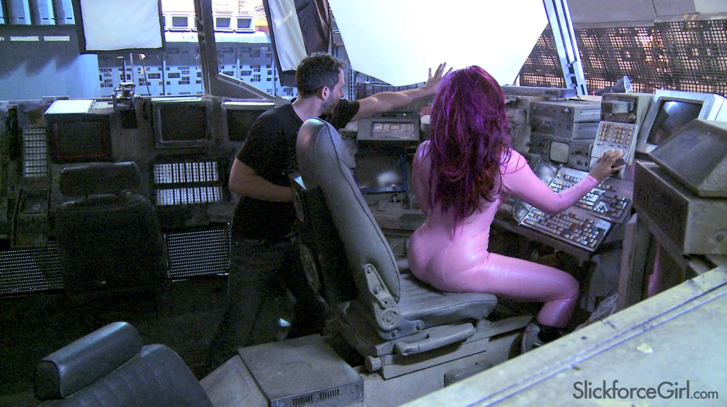
We found a huge spaceship set that was built on a sound stage for a sci-fi movie, and they hadn’t broken it down yet. It was architecturally perfect, but aesthetically very gray and drab. I wanted a very stylized color palette for our pop version of deep space, similar to the bioluminescent scenes in James Cameron’s Avatar.
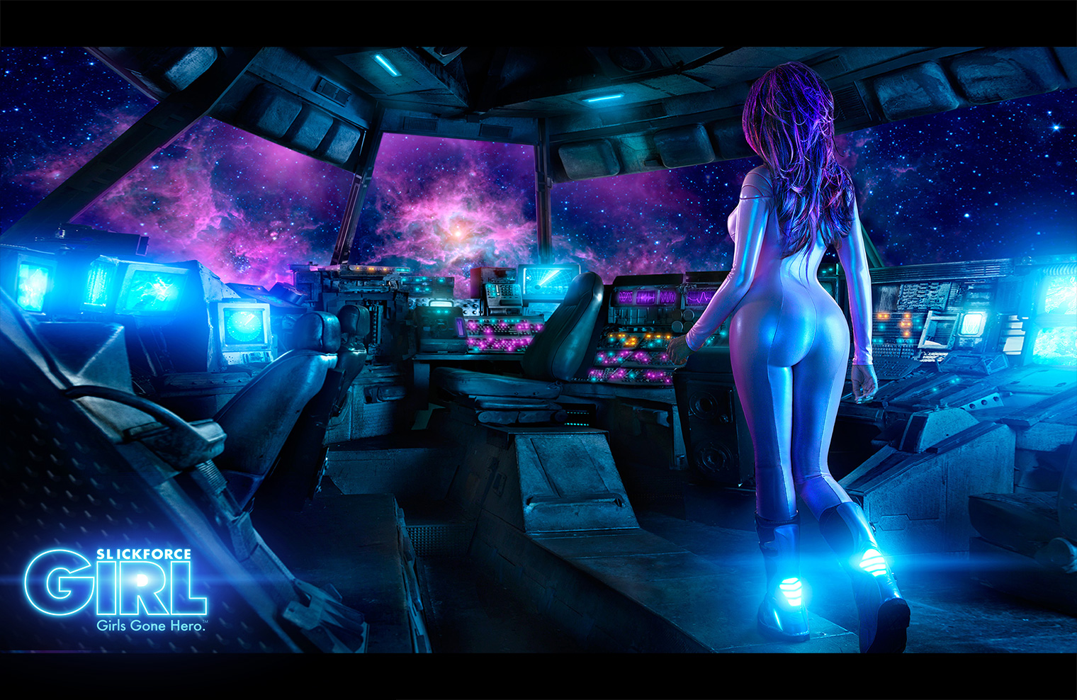
One of the ways we achieved this was through costume and glam. We originally planned on putting model Vanessa Veasley in an actual NASA Mercury suit, but quickly discovered they were so bulky that it was impossible to shoot anything even remotely sexy. So we had her space suit custom-made, and used fabrics with a reflective sheen to capture the “monitor glow” around the spaceship.
FS: How did you approach the lighting for this concept?
NS: For the cockpit scene, we had two lighting motivators — the interior glow from the monitors and bridge controls, and the exterior glow from the stars. There’s really no manual on lighting for outer space, so I looked at old American Cinematographer articles on Armageddon and Terminator 2 for inspiration.
I didn’t want to deal with the spill from green-screen, so we built two 12×12 white griffolyns outside the cockpit window and fired 4 heads on two 2400w/s packs into them. Compositing is much easier in stills than in motion-picture, so you can use whatever color you want to end up with. We then created “nebula hits” by pointing a couple of strips and softboxes with pink and purple gels directly at Vanessa. The trick with making outer space ambience look believable is to let some of the scene fall completely to black, so we were very careful not to overlight the cramped space. For the interior cockpit glow, we placed small double-silked strip lights with steel blue party gels around the ship and behind camera.
This scene was shot at ISO 100 on a 50mm lens (medium format). Even though we were wide, the biggest challenge is carrying the depth of field at that speed because theoretically both Vanessa and “the stars” needed to be in focus. Ultimately, we were able to get the light barely to an F4/5.6 split, and then I set the lens to F8 and let it underexpose a stop-and-a-half, except for a few highlights on her suit. It would have taken too much power to get our ambience higher, and if there were really stars outside that window, the light that reached the ship would be perfectly believable a few stops under key. Also, blues and purples saturate better at a darker luminance than warm colors so it ended up working in our favor.
(Read the complete interview on Fstoppers here.)
— My thanks to Rebecca and the Fstoppers team for a great interview!




You must be logged in to post a comment.