Archive for the ‘Glam Shoots’ Category
Flashback: November 29, 2008 – SHOWCase #2
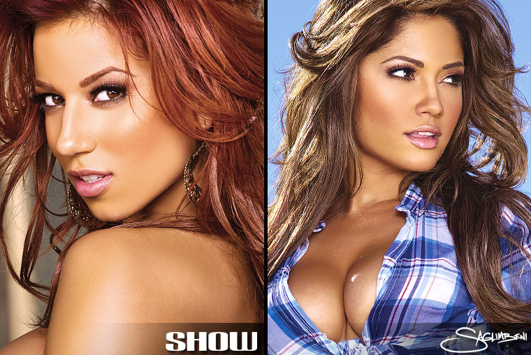
Scorchers in the desert
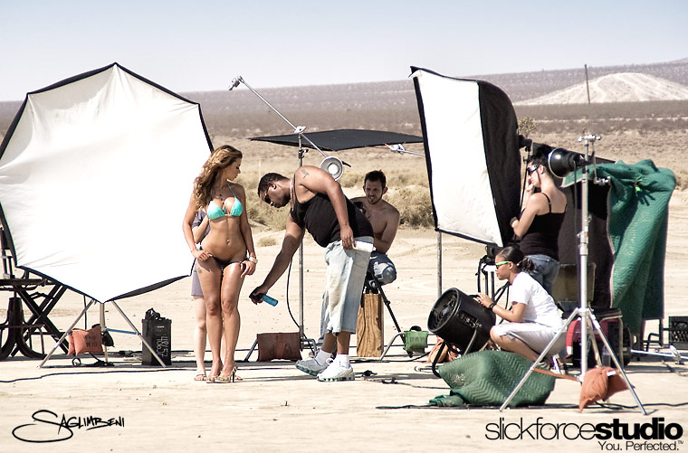
Production shots:
SHOWCase #2 was the 4th full magazine issue I produced in its entirety. I think I had gotten the publisher of SHOW hooked on desert shoots just like I was, so we shot the “sequel” to SHOWCase #1 within 60 days of shooting its predecessor.
For those of you who know my background as a cinematographer, it’s no surprise why I get so excited shooting on location. I mean, no photographer LOVES being inside the studio every day…it’s like letting a dog out of the house to run free. So as SHOW became more successful (which is 100% shot on seamless), I found myself pushing to shoot the special issues as far away from SlickforceStudio as possible.
I had just bought my property in the desert (which would become Ultimate Graveyard), but I hadn’t been able to put any real time into it, so I felt it wasn’t yet camera-ready. Instead, I chose Club Ed, one of my favorite desert locations as a DP. They’ve shot a billion movies here, most notably Rob Zombie’s “The Devil’s Rejects,” and “Nothing to Lose” starring Martin Lawrence and Tim Robbins.
One of the reasons I like shooting in the desert so much is that it forces you to be on your A-game. You’ve got no water, no power and no restaurants for miles, so you have to run a really tight production. We brought in RVs, generators, and of course I had my crack team of super-assistants making runs around the Antelope Valley all day (my assistant Cherry got a speeding ticket that day too…sorry, Cherry!) I sometimes get a lot of flack for my super-sized productions, but I’ve never been a minimalist—it’s just not my style. My inspirations have always been larger-than-life directors and photographers, like Michael Bay, James Cameron, Antoine Verglas, and Herb Ritts.
The models for SHOWCase #2 were soon-to-be-Playmate Jessica Burciaga and urban-superstar-model Jesikah Maximus. I labeled my Capture folder “Jes².” I had worked with them both on countless issues before and I knew they were both great models (J-Max and I were in Puerto Rico shooting her “SHOW: In Paradise” issue exactly one year earlier) so I already had their trust. And that’s very important, because when the models trust you, you can push them very, very far.
These girls both had crazy bodies, and when J-Max showed up with her fire-engine-red hair, I decided was going to photograph them as if I were shooting a comic-book. I had them kneel on scorching-hot gas pumps, pour buckets of water on themselves, crawl on trucks, and roll around in the dirt. But man, did this issue kill. I have to say that this is probably the first issue I’ve shot that turned out exactly like I saw it in my head. And that’s not easy for 100+ pages of content. And although the day was long (15+ hours) and everyone was beat to sh*t, it was some of the most fun I’ve ever head on set. I think it was probably in my top 3 days of 2008. It’s one of those rare moments where you stop to reflect, take a look around, and realize you’re doing exactly what you dreamed of doing when you were a kid.
Flashback: February 2008 – Roselyn Sanchez Maxim Cover
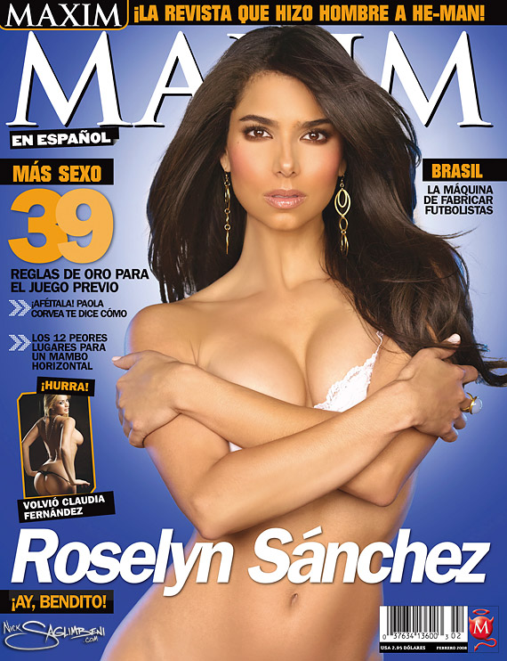
When Maxim en Espanol editor Juan Rotulo called me to photograph Roselyn Sanchez for the Feb 08 cover, I was thrilled. I mean, Roselyn is easily one of the most beautiful women in the world, and from what I’d heard, she was also a total sweetheart. It also seemed unlikely that I could take a bad picture of her.
The trick, it seemed, was actually going to be figuring a way to deliver the publishers a smoking-hot newsstand cover they could sell, while simultaneously keeping the spread classy, so as not to insult the Without a Trace actress (or her publicist. *shaking head*) After all, Maxim en Espanol had always pushed the envelope much further than US Maxim.
I booked the Mayan Theater in downtown LA, now a popular night club, for the shoot. It featured Mayan architecture influences that would make fantastic backdrops, but remained super-convenient for Ms. Sanchez’s travel purposes.
Roselyn was a total superstar on camera, extremely comfortable with herself, and not an ounce of diva in her—very down to earth. She did request her own glam squad (working with new people always adds an extra variable, because I know what my team can deliver,) but I was able to pull in Jenny Ricker from the Wall Group for wardrobe—who had styled my Kim Kardashian shoot a few months earlier.
I was really tight with the guys at Maxim, not only with Juan but with Oscar Saavedra, the Art Director (I always seem to get along with Art Directors). They gave me a lot of input on choosing selects to run in the mag, and happily all of my top choices ran in the spread, including the cover. That said, I still had to get Roselyn’s approval, so I (probably naively) requested that she sit with me to go over the shots. I was stunned when she said yes.
Sitting in my industrial LA studio office, Roselyn Sanchez and I went through each pic, and she even signed off on the near-naked cover shot. Then we sat for an additional 2 hours and talked about the industry and her upcoming engagement. I don’t think I can name a client who was more grounded.
Alas, it looked like I was gonna make both camps happy after all. The cover ran exactly as I envisioned, and I was ready for a year of home-run celebrity covers. Sadly, though that issue was one of their highest-selling issues ever, Maxim en Espanol went under two issues later. (They were dissolved into Maxim Mexico and they now put Espanol covers on the Mexico magazine so it appears to still run as a unique title.)
Roselyn Sanchez was my favorite cover during my 2-year run with Maxim en Espanol.
QuickTrim/GNC Holiday Ads featuring Kim & Khloe Kardashian
Kardashian Clone Wars
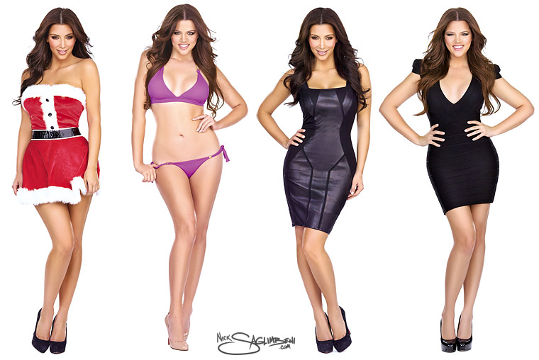
I was recently hired to shoot the campaign for QuickTrim weight-loss supplement, featuring Kim & Khloe Kardashian. This was my first time meeting Khloe. She was not only a pro like her sister, but she has a sarcastic edge to her which is hilarious. Kim and I seem to always be in sync, so the shoot flowed really smoothly.
The TV crew from Keeping up with the Kardashians was at Slickforce that day, taping the drama that accompanied the photo shoot. Rumor has it we’ll be in one of the first few episodes of Season 4 which airs this December. I’ll keep you posted on all that jazz.
2009 PETA Campaigns
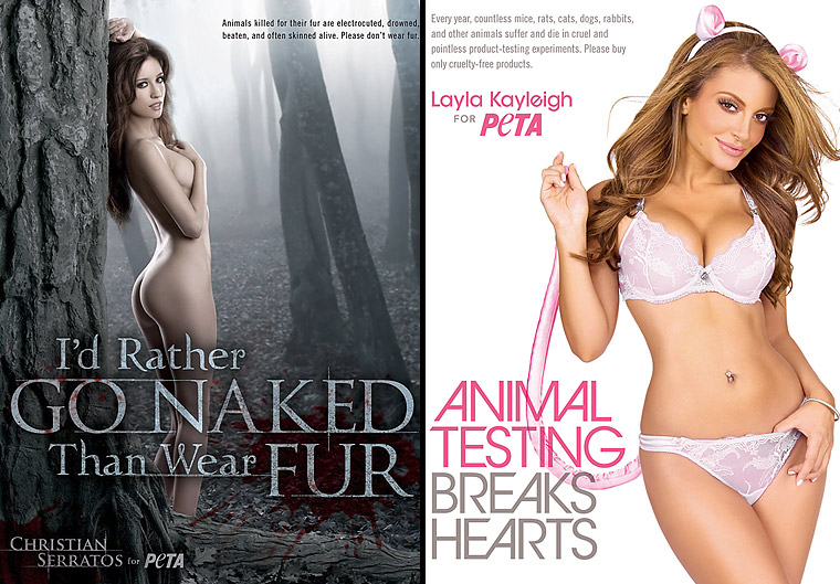
Is there a breeze in here?
One of our new 2009 clients was People for the Ethical Treatment of Animals. I guess they figured they’ve got a lot of women wearing nothing for the animals…and we make women look great wearing nothing LOL. So I think it was love at first sight for our companies. (Actually, I owe a special thanks to Layla Kayleigh for turning PETA on to us.)
These are two of the three campaigns we shot in 2009—the third will be released in Feb 2010. Layla Kayleigh and I first met on a magazine shoot in early 2008, and we’ve remained friends ever since. When PETA asked her to do their “Animal Testing Breaks Hearts” campaign, she was sweet enough to recommend me for the gig.
Working with friends on a national campaign is really kind of surreal, because, oddly, no one is stressed out. Layla knows I’m gonna make her look great, I know the camera loves Layla, and we both know our beloved make-up artist Therese Willis is gonna take it to another level. It’s also really fun sticking mouse ears, a tail, and a virtual mouse (we used a plastic penguin for the stand-in) on your friend, who thousands of guys are in love with.
The next campaign was with Twilight‘s Christian Serratos. This was my first time meeting Christian, but she was a super-pro and very easy to work with. Michelle Cho from PETA and I had discussed a Twilight-like forest concept, so I knew I had two options: shut down the Angeles National Forest and light it with 18K HMIs from condor cranes like in Lord of the Rings…or greenscreen (LOL).
Sorry for the sarcasm, but I’ve just never been partial to greenscreen. Don’t get me wrong, compositing has its place, and I do it when necessary, but even then I try to build at least some of the set practically. For one, it helps the model/actor interact with the environment believably. Second, I think it disciplines you to build a concrete vision of the final product in your head, instead of what a lot of photographers are doing now, which is shooting the model now and figuring out the background later. The two dead giveaways for composited shots are the floor (where the feet meet the ground) and that all-too-common uniform backlighting…because it’s easy to cut out, but the lighting is always unmotivated. (Okay, enough soap-boxing.)
So I went to a greenery rental house in the Valley and rented a big tree. The people in my building thought I was crazy, and they’re not far off. I opted to shoot gray-screen instead of green-screen because I knew Christian was going to be naked and I didn’t want that awful green spill on the girl’s skin. Just drives me crazy. I knew I was going to fog up the background and desaturate it anyway, so gray made the most sense.
I’m really happy with how both campaigns turned out. I have to say the PETA crew is super cool, and my whole staff loves working with them. Michelle may be the coolest director/person-in-charge/celebrity-liaison I’ve ever met in my life. I hope we work together for many, many years.
Shooting PETA comes with it’s share of controversy, of course. SlickforceStudio was featured on Fox News recently while they were tearing apart PETA and the Christian Serratos/Twilight campaign…something about the exploitation of women and all that. Okay, guys. Thanks for the publicity.
Flashback: August 17, 2007 – Kim Kardashian @ Edison Bar
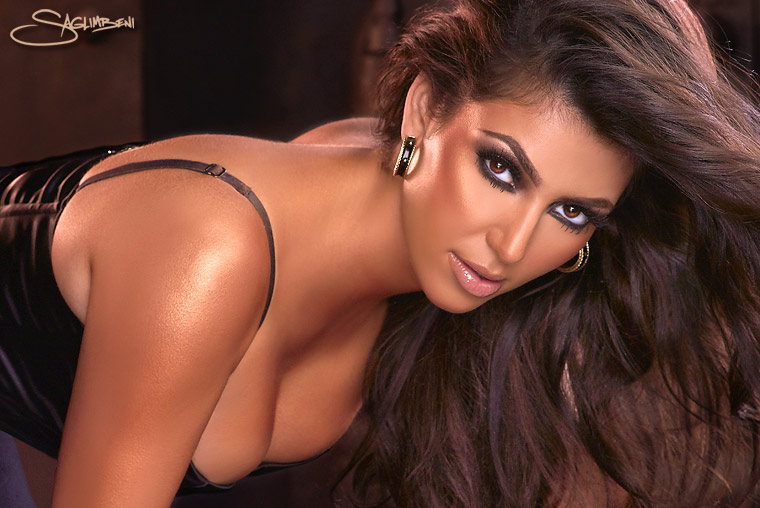
A dash of awesome.
Lighting & Exposure Tests:
In August 2007, after 2½ years in the magazine world, I was gaining a reputation for photographing beautiful women. And that year, there was no one with more beauty and buzz than Kim Kardashian.
When I teamed up with the short-lived Coexistence magazine, whose goal it was to introduce notable personalities of Middle Eastern descent to the mainstream public, Kim was at the top of their wishlist. She was the entertainment industry’s “It-girl.” Through a friend of a friend, I managed to get in touch with Kim’s people, and once I had the greenlight, my mind started racing. I wanted to take her to the desert (surprise!), but her publicist told me it wasn’t happening. Too far, too dirty. Make it local and convenient, I was instructed.
I love contrasting beautiful women with dirty, busted environments, something I did in that same Coexistence issue with my Skid Row Princess fashion spread. I’ve always been secretly envious of photographers who live near desolate, forgotten areas because there are so many old and crappy buildings and environments to place your model. In Los Angeles, everything is, well, new and crappy. We finally settled on The Edison bar in Downtown LA, which was formerly a power-plant in the old Higgins building, built in 1910. Nearly 100 years old, and totally awesome.
I did a ton of prep for this shoot, pulling tear sheets, shooting backplates, and storyboarding. I was ready to pitch a hard sell, because at that point, Kim didn’t have a clue who I was, and it was clear that her publicist didn’t like me or the magazine very much.
But when it came right down to it, Kim was suprisingly easy to work with—she was even down with all of my poses, as I had her crawl on cold metal boilers and arch her back on cast-iron stoves. No drama whatsoever—she was a total sweetheart.
Since this was back before I started hiring behind-the-scenes photographers, I managed to pull the next best thing: lighting and exposure tests with my assistants from the shoot, Corey and Zak (known affectionately as “the goons”…note the excited look on their faces). The Edison had lots of moody practical lighting that the cinematographer in me went crazy for, but alas, none of it was gonna show up at 100 ISO. So I took long-exposure plate shots to allow the practicals to burn in and gauge the actual color temperature, then I gelled my strobes and lit Kim properly, effectively letting the background go F* itself. Finally, I blended the two shots in post…sort of a ghetto HDR.
When the mag was released in December 2007, some people commented that these shots looked overly retouched. But the truth is that the cell-shading look on her skin is more a result of heavy bronzer (make-up) combined with the oversaturation of my gelled lights. In hindsight, I should have shot her naturally (non-gelled strobes) to preserve the white highlights, and then warmed her mids and shadows in post. All in all, I still love this shoot. Due to positive female customer feedback, it headlined the Slickforce.com website longer than any shoot I’ve ever done.
Even better, Kim and I kept in touch after the shoot, and I’ve now shot the entire Kardashian family several times over. When she went blonde in summer ’09, she called me to capture it before she went back to classic brunette. Kim later leaked a photo from that shoot on her blog, which resulted in my first call from TMZ—hilarious. I’ll post more info on that shoot soon.
Chris “The Birdman” Andersen enjoys his own half-time show in Rebel Ink
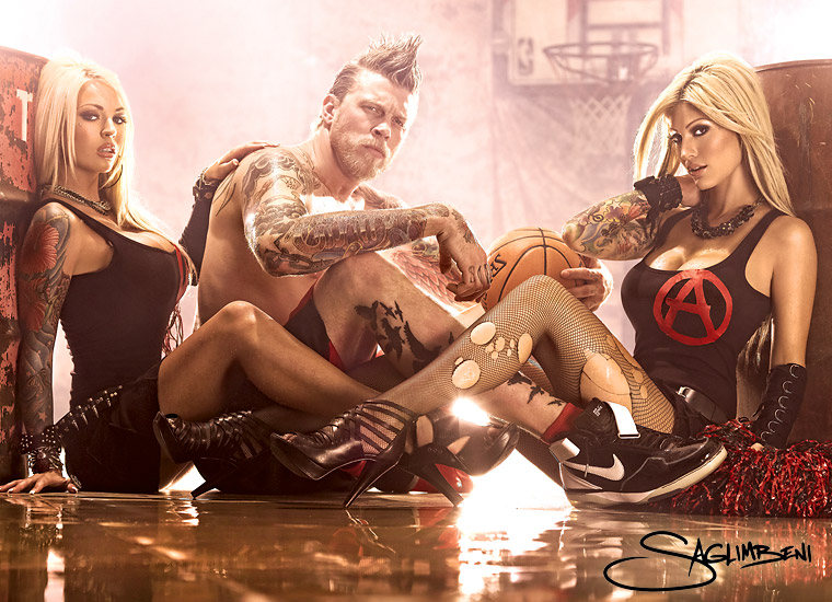
If cheerleaders looked like this, I never would have left high school.
Production Shots:
I’m terrible at shooting guys. Okay, well, maybe not terrible, but I find it much easier to direct women. Women have a range of acceptable looks to experiment with: sexy, innocent, smart, flirty, badass, adorable, etc. Men just like to look cool. And Chris “The Birdman” Andersen was definitely that.
For my shoot with Chris (and models Destiny Daniels (left) and Esther Hanuka (right)) for Rebel Ink magazine, the editor and I discussed recreating the set from Nirvana’s “Smells Like Teen Spirit” video. We got some old oil drums, a beat-to-shit muslin backdrop, my awesome intern lent me his cousin’s basketball hoop, and we soaked the concrete floor. Anyone who has a studio knows that it doesn’t take long for you to shoot out every possible angle and background, and wish you had a different studio. But this might be the best Slickforce has ever looked.
Chris was cool as hell, and his demeanor put the models at ease as well. As with nearly all mag editorials, you need a centerfold/spread. And you’d be AMAZED at how hard it is to find a centerfold pose for a guy (try it right now…see? WTF is he gonna do, lie down and arch his back?) So I was thrilled with how well this 3-shot spread came out (above). It’s one of my favorite shots of 2009, and I’m gonna get a poster up in the studio.
This shoot appears in the January 2010 issue of Rebel Ink, on stands now.
Vida Guerra’s return to modeling at Ultimate Graveyard
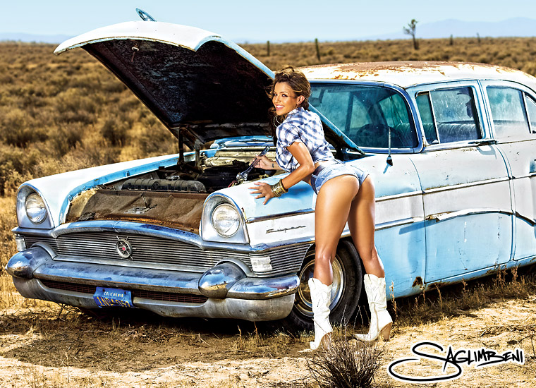
Here’s your Pep, boys.
Production Shots:
I was thrilled when I got the call that Vida Guerra was returning to modeling. She was my first celebrity model client when I started shooting magazines. I first worked with her on shoots promoting National Lampoon’s Dorm Daze 2. By 2006 we were working together almost exclusively (I think I missed a King and an FHM cover due to prior arrangements), so I was extra bummed when she retired from modeling in early 2007, right after we shot her calendar in Cancun (THAT was a fun trip with lots of stories that I’ll save for later, but remind me to tell you about calling Vida’s dad the wrong name all week and something about a chicken.)
When approaching a shoot, I always try to avoid repeating not only myself, but also other shoots that the model has done. With a model like Vida, you have to accept that guys are buying the mag primarily for her incredible shape. But having become Vida’s friend, one thing I always felt that other photographers missed was her smile and her personality. Yeah, her butt is great, and that’s easy to make look good, but I decided to show Vida in a way she hadn’t been seen before—having ridiculous fun. This was Vida’s first magazine shoot in over two years, and I wanted something really different. So what better location than Ultimate Graveyard?
We all busted our butts for the two-day shoot, and I towed that ’55 Chevy Clipper into the desert with my Hummer (I picked it up at an auction for $500…the Clipper not the Hummer LOL). Then, all the production vehicles, including the RV, got stuck in the sand due to windstorms, so I had to tow 5 vehicles out of the sand. That was the day I fell in love with my truck.
Vida says this is her favorite shoot ever. Hopefully the fans like it too.
(And as you’ll see in the behind-the-scenes, my crew really helped me hit this one out the park. Love to my awesome Slickforce team.)
Flashback: October 1, 2008 – SHOWCase #1 @ El Mirage
Production Shots:
Found these behind-the-scenes pics while going through the archives, and thought you guys might like to see.
This is from the premiere issue of SHOWCase (shot Oct 2008), featuring Vanessa Veasley and Laura Dore (then known as Sweetie Cyanide). I’ve always loved shooting in the desert, and this was actually the day I got inspired and decided to buy my own desert property, and Ultimate Graveyard was born.
This issue was a lot of fun to shoot, and I’d worked with both models many times before, so we could cut to the chase and just shoot amazing stuff. I already knew what poses worked best for both of them. These ladies endured both the heat (day) and the cold (dusk), and for anyone who thinks I just liquify my models…these production shots are COMPLETELY unretouched, so take a good look at their bodies and you’ll see just how real they are.
If I’m guilty of anything, it’s putting Vanessa in too many back-arch-orgasm-face poses, but hey, it was just really working for me. (And the white boots didn’t hurt either.)
(BTW it was hot as hell that day and I was tired of the models getting all the attention, so I decided to go shirtless too. Sue me. If you look closely, you’ll see that my stylist isn’t even wearing pants, so there.)
