Archive for the ‘Fashion Shoots’ Category
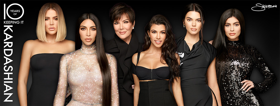
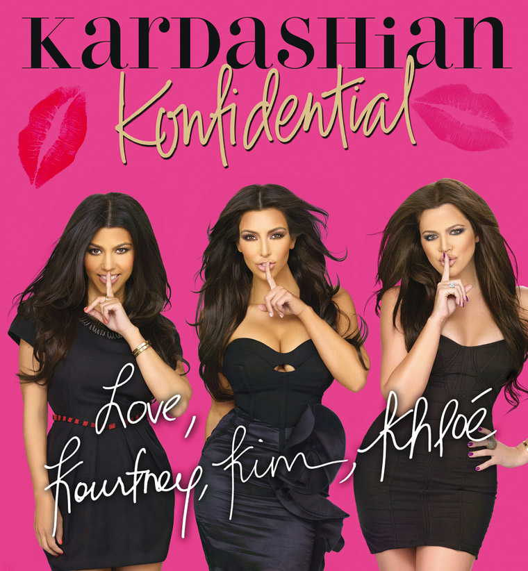
An inside look at the world’s hottest family in Kardashian Konfidential!
I am going to steal your brains! *Frankenstein groan*
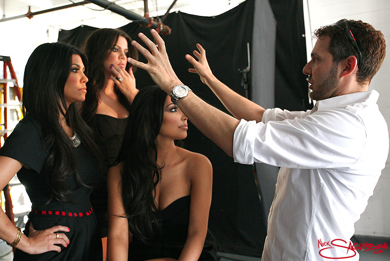
In March 2010, the Kardashian sisters called and told me about a new book they had coming out, called Kardashian Konfidential. They asked if I’d be interested in shooting new images for the cover, to which I naturally said yes. After speaking with the publisher, however, it was clear that they needed an even greater range of images to use throughout the book, and so we planned this day at the studio.
The Kardashian/Jenner family had plenty of images of the girls growing up, etc., but what they needed now were shots of the modern-day Kardashians, as the world currently knows them. So we devised a shoot that was three layers deep—similar to the dream levels in Inception. First we set up our usual studio shooting area to capture staged and posed images for the cover and the inside of the book. Then, two of of my assistants captured production shots of the making of the shoot, and in between takes I would grab one of their cameras and follow the sisters to hair and make-up, where they would tease each other and play while prepping for the next shot. Finally, there were publicity crews from E! that captured press footage of my crew shooting behind-the-scenes of my actual shoot with Kim, Kourtney, and Khloé, that they could use to promote the book. It was a very fun day, but one where we didn’t stop shooting in some form from start to finish.
The book is available everywhere on November 23rd. I received my advanced copy a few weeks ago, and I’m thrilled with the final product. Kardashian Konfidential is a quality coffee-table book, with exceptional layout and printing, all very professionally done. Though the cover is a bit pink for my taste, I also realize that I’m not the target teenage female demographic. I’m sure this book will fly off the shelves. Brilliant work by the team at St. Martin’s Press for a fantastic publication!
CREDITS:
Wardrobe Stylist – Monica Rose
Make-up by Mario Dedivanovic
Hair by Frankie Payne
Additional Photography by Cherry Gardner and Derek Eskridge
Khloé Kardashian goes classic glam for Celeb Life
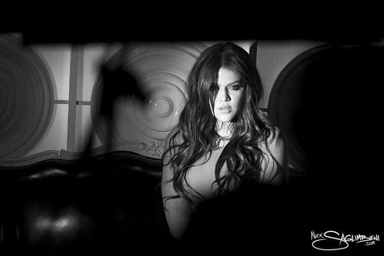
In April 2010, I photographed Khloé Kardashian for Celeb Life magazine. I remember this shoot vividly because it was the last shoot before I left for my monthlong trip to Kenya.
Khloé’s always been a treat to work with, because not only does she take amazing shots, but she’s also incredibly funny, generous and down to earth. I was excited about this day in particular because it was my first fashion shoot with Khloé. Super-stylist Monica Rose brought amazing clothes as always, and Mario Dedivanovic lent his signature Kardashian-glam artistry to the make-up.
The location was a wonderful boutique hotel in Beverly Hills called Maison 140. It also provided me a unique challenge—the smallest spaces I’ve shot in my entire career. And with my lighting setups, it was no easy feat. My superstar Slickforce team kicked butt as always, including lead assistant Christian Arias, assistants Cherry Gardner and Derek Eskridge, and intern Asha Catling.
I was extremely happy with the final results of the shoot, and Khloé exceeded my expectations and delivered incredible energy in the pictures. This is hands-down my favorite shoot of hers to date.
Great work to Derek Eskridge for capturing these brilliant noir-style production stills.
The Making of a Superstar: Kendall Jenner, Part 2 of 2

Watch out, world!
As you read in my post on day 1 of this shoot, this session was planned to build Kendall Jenner’s Wilhelmina Models portfolio from scratch. This shoot also generated more controversy than any shoot I’ve ever done.
To date, these photos, or discussion of them, have been featured on Larry King Live, E! News, Inside Edition, Access Hollywood, US Magazine, OK! Magazine, The Huffington Post, and over 50 blogs.
As with day one, Kendall was an absolute natural in front of the camera, and a pleasure to work with. In hindsight, I’m glad we got the more difficult beach shoot out of the way on the first day, because it really made this second in-studio day a cakewalk.
Special thanks to Clyde Haygood on hair, Rob Scheppy on make-up, Monica Rose for her always-brilliant styling, my ace-team at Slickforce, and to Kris Jenner for shepherding me through the publicity storm!
HairLocs International 2010 Campaign
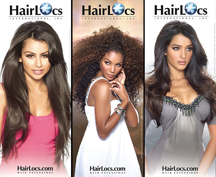
This week, HairLocs International launched its nationwide campaign across nearly every Niche Media title, including Ocean Drive, LA Confidential, Gotham, Hamptons, and Vegas magazines. Through a good friend of mine, Lupe Ceballos, for whom I used to photograph recording artists, I was able to bring the campaign to SlickforceStudio. We handled everything from the production to the casting—which is why you may recognize some of your favorite Slickforce superstar models in the campaign.
The shoot was incredibly fun, especially for hair-stylist Al Ingram, because we got to experiment with many ways of making hair look exciting on camera—and you all know I love amazing hair. Slickforce lead make-up artist Gaby Ramos nailed every shot in this campaign, which is even more impressive given the full spectrum of model complexions that she worked on.
Thanks to HairLocs and to the incredible Slickforce team for helping to create a beautiful campaign!
MODELS (Left-to-right thumbs): Airess Padda, Nazanin Mandi, Ayanna Jordan, Jenifer Richardson, Remington Nelson
The Making of a Superstar: Kendall Jenner, Part 1 of 2
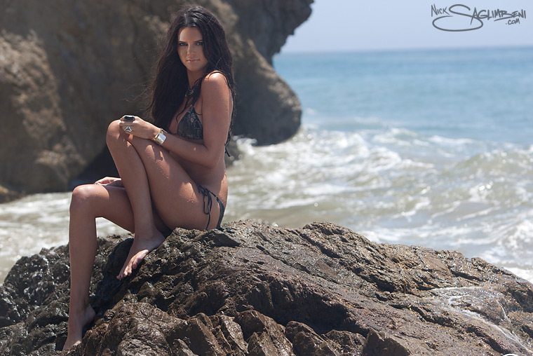
It’s not everyday you get to work with someone you know is going to be big. I mean, it’s different if they’re already a star…but there’s a special energy that happens on a shoot when you know that one day people will be looking back at this shoot, to see where it all began.
Such luck smacked me across the face last week when Kris Jenner, mastermind and matriarch of the Kardashian clan, asked me to photograph her daughter, Kendall, for her Wilhelmina modeling book. She had been very happy with the shoots I’d given Kim, Khloé, and Kourtney, and she was hoping I could do the same with Kendall. The only catch, you see, is that she’s only 14-years old.
Kendall was a trooper right out of the gate. I asked her if she minded getting in the water, crawling on sharp rocks, etc., and she simply shook her head and said she’d do whatever it took to make art. Thanks to her sisters, I had Kendall’s trust. So, as I do with every model, I immediately got the hard stuff out of the way, because there’s never enough sunlight for a warmup period. I stuck Kendall on a rock in the middle of the Pacific Ocean, and she held her poses with incredible professionalism—and her faces with intensity—even as waves smacked her in the back of the head.
The rest of the shoot went much the same way, and Kendall’s learning curve was incredibly steep. I was continually impressed with how quickly she took what she learned from one setup and applied it onto the next one. By the time a girl is 21, which is the average age I photograph, I expect them to have had at least a few good years of checking themselves out in the mirror and working their poses. But for a 14-year-old with almost no experience (save her celebrity genes), Kendall hit this one right out of the park for sure.
I didn’t expect the controversy that this shoot generated—it’s already been featured on E! News, People, In Touch, Extra, and Access Hollywood. Apparently some thought the shoot was too provocative for such a young model (sample video here). But to be fair, we should make a distinction between fashion modeling and glamour modeling. If you look at the early work of Adriana Lima, Brooke Shields, Miranda Kerr—the list goes on—their books were filled with sensational-yet-hardly-conservative images that launched them into supermodel status before age 16. In my opinion, whether the model wears a sweater or a swimsuit bears little relevance, as long as the shoot is tastefully done. I made a concerted effort to keep this shoot a very healthy PG13.
I have to give special love to stylist Monica Rose on this shoot, who not only brought incredible wardrobe as she’s always done with Kim, and who sat by the laptop making sure every frame was perfect, but who also was waiting in tow with a robe and towel, ready to warm up Kendall each time she ran back shivering onto the beach. You’re the best! xo
Credits:
Wardrobe Styling: Monica Rose
Make-up: Joyce Bonelli
Hair: Rob Scheppy
Production Stills: Derek Eskridge & Christian Arias
The Kardashians get wild for DASH Miami!
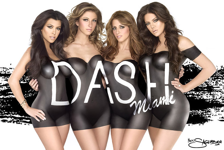
Kourtney and Khloé Kardashian recently asked me to photograph a new campaign for the re-launch of their DASH Miami boutique. They wanted something that would stop everybody in South Beach dead in their tracks. What better, I thought, than having them get naked?
Well, that’s not entirely true. I did suggest strategically painting the DASH Miami logo across their bodies, so as to keep the ad below porn-level. I wasn’t completely new to the body paint scene, as I got a lot of press for my Vida Guerra painted-as-a-tiger cover a few years back. But what I did remember was that THAT paint job took 3 hours for one model, and I knew we couldn’t burn that kind of time. So I called one of the best body paint artists in Miami, Keegan of Body Art by Keegan.
I flew to Miami and quickly assembled a clone version of SlickforceStudio, so the girls would feel right at home. They cast two of their very own DASH Dolls to join them in the campaign. Once the ladies were all on set, we experimented with a few different poses and body positions, calculated logo placement, and then the fun really began.
Special thanks to SlickforceStudio assistant Gabe Parra for these awesome pics!
Kim Kardashian’s 2011 Dual Calendar Shoot
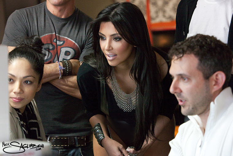
It goes without saying that Kim Kardashian is one of my favorite clients. So when she contacted me to shoot not one, but both of her 2011 calendars, it didn’t take much convincing. Now, why would anyone need two calendars, you may ask? Good question.
Kim made waves on the gossip circuit when she went renegade last summer, tossing aside her classically perfect brunette hair and swapping it for a blonde look. When fans cried for the return of natural Kim, she called me. “I have to go back to brunette for the show,” she said, “but I want you to capture the blonde before I change it back!”
Deal. So two days after returning from a shoot in Italy, I got Kim in my studio and we shot her 2011 calendar. You can read her words on the shoot here. Later, when I sent her the final images, she had a brilliant idea: “Let’s do TWO calendars! One blonde, one brunette!” And that, my friends, is why the woman is a mogul. She can sell anything.
Shoot #2 was scheduled in late January. And finally, on our fifth shoot together, I successfully convinced her to let me bring in a behind-the-scenes crew (you gotta understand, this girl has cameras following her everywhere…) This shoot was incredibly relaxed, as her crew and I have now worked together several times. We’ve learned to play off each others strengths, as any good team does, and Kim really has fantastic people on her team. Mario Dedivanovic’s make-up is flawless, Frankie Payne nails my favorite windblown look every time, and Monica Rose’s styling is always mind-blowing.
Look for an upcoming post once the calendar previews are released!
Thanks to Slickforce’s own secret-weapon Joyce Park for these great production shots!
Flashback: October 4, 2006 – Live-action Storyboards for MIRAGE
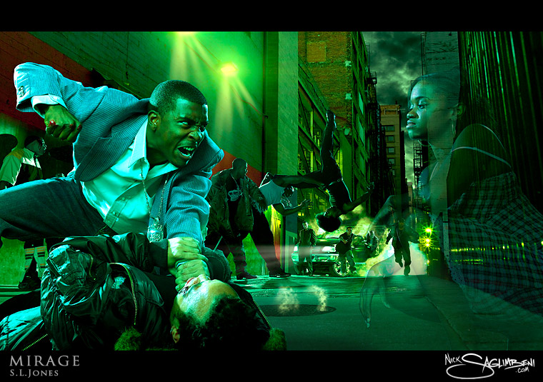
I said I’m watching Gossip Girl, b*tch!
Once in a blue moon, a project comes by that changes my style forever. Mirage was one of those projects.
My good friend and writer/director Stephanie Jones approached me with an interesting concept. She had a feature-film script that she was about to pitch to a major studio, but as those in the entertainment industry know, the execs that greenlight films are rarely artists themselves, and as such, they often have a hard time visualizing how a script will translate to the screen. Stephanie was a USC Cinema alum, like myself, and I had worked with her as a cinematographer several times. She was hoping I could take what was in her head and capture it visually. It would be just like storyboarding, only far more realistic.
Logistically, this shoot was a beast. There were 8 full concept shots, each at different physical locations, and all containing multiple characters. The beauty of motion picture is that you can rack focus from one character to another. But in a still it meant I’d need an enormous depth of field to keep all characters in focus.
In what became the most memorable image of the series, known as the “Alley Fight” (pictured above), I had 12 characters in the shot, ranging from 2 feet to 70 feet from camera. It was also scripted as a night scene, which meant I’d need a ton of light to get a reasonable depth of field at 100 ISO. And I’m guessing Stephanie thought I didn’t have enough to worry about, because on top of all of that she told me 6 of the actors would be in fast motion (running and flying through the air!), so slow-shutters were impossible too. I love pressure!
Given the technical demands, I decided that capturing the shot in one take was impossible. I would have needed to shoot at F32 at 100 ISO…yeah you try that, lemme know how it works out! So I had to get creative. I locked down the camera and broke up the scene into four stages: foreground, middleground, background, environment. The environment shot was key because I wanted to avoid the fake look of green-screen photography. I needed to know where my lights and shadows would fall if you actually saw this fight on the street. At dusk, I shot the alley at a 30 second exposure. Then I had all 12 actors stand in, and we blocked the shot just like an actual film scene. I needed to make sure all the action would be seen and that actors wouldn’t be blocking each other. Once we marked the characters’ spots we then pulled them out and shot them in groups. The foreground was the most important, because it featured the leads, so I shot that first. Then the middle ground, which was perhaps the most fun, because it was a full-on stunt scene, coordinated by my friend and action-director Alex Wen (The Matrix, Lethal Weapon 4). Take a look at the raw capture and you’ll see that we really threw that guy in the air—full invert! Then finally we shot the background stage, as well as various exposure plates, such as smoke from the truck and wetdowns on the street. It’s also important to note that we ultimately color-timed the final image to match the environment plate, rather than the other way around—yet another reason why it’s so important to shoot scenics first whenever possible.
This was relatively early in my photography career, before I started bringing in a behind-the-scenes photo/video crew, but the uncomposited images tell almost as descriptive a story. In the end, only two of the shots were done in-studio on green-screen; the rest were all shot as location composites, in similar form as described above.
The alley shot went on to win the Grand Prize GURU Award at PhotoshopWorld for Best Compositing. I’m really proud of the fact that it’s a location composite versus an afterthought shot in studio, which I think adds to the visceral nature of the final image.
Flashback: August 17, 2007 – Kim Kardashian @ Edison Bar
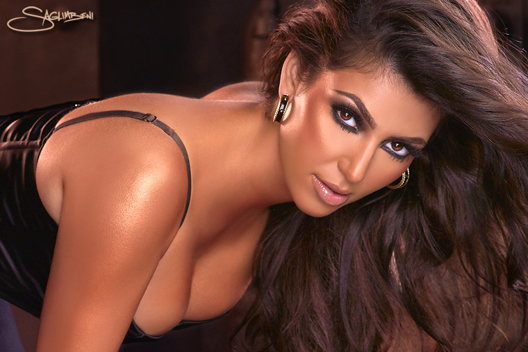
A dash of awesome.
Lighting & Exposure Tests:
In August 2007, after 2½ years in the magazine world, I was gaining a reputation for photographing beautiful women. And that year, there was no one with more beauty and buzz than Kim Kardashian.
When I teamed up with the short-lived Coexistence magazine, whose goal it was to introduce notable personalities of Middle Eastern descent to the mainstream public, Kim was at the top of their wishlist. She was the entertainment industry’s “It-girl.” Through a friend of a friend, I managed to get in touch with Kim’s people, and once I had the greenlight, my mind started racing. I wanted to take her to the desert (surprise!), but her publicist told me it wasn’t happening. Too far, too dirty. Make it local and convenient, I was instructed.
I love contrasting beautiful women with dirty, busted environments, something I did in that same Coexistence issue with my Skid Row Princess fashion spread. I’ve always been secretly envious of photographers who live near desolate, forgotten areas because there are so many old and crappy buildings and environments to place your model. In Los Angeles, everything is, well, new and crappy. We finally settled on The Edison bar in Downtown LA, which was formerly a power-plant in the old Higgins building, built in 1910. Nearly 100 years old, and totally awesome.
I did a ton of prep for this shoot, pulling tear sheets, shooting backplates, and storyboarding. I was ready to pitch a hard sell, because at that point, Kim didn’t have a clue who I was, and it was clear that her publicist didn’t like me or the magazine very much.
But when it came right down to it, Kim was suprisingly easy to work with—she was even down with all of my poses, as I had her crawl on cold metal boilers and arch her back on cast-iron stoves. No drama whatsoever—she was a total sweetheart.
Since this was back before I started hiring behind-the-scenes photographers, I managed to pull the next best thing: lighting and exposure tests with my assistants from the shoot, Corey and Zak (known affectionately as “the goons”…note the excited look on their faces). The Edison had lots of moody practical lighting that the cinematographer in me went crazy for, but alas, none of it was gonna show up at 100 ISO. So I took long-exposure plate shots to allow the practicals to burn in and gauge the actual color temperature, then I gelled my strobes and lit Kim properly, effectively letting the background go F* itself. Finally, I blended the two shots in post…sort of a ghetto HDR.
When the mag was released in December 2007, some people commented that these shots looked overly retouched. But the truth is that the cell-shading look on her skin is more a result of heavy bronzer (make-up) combined with the oversaturation of my gelled lights. In hindsight, I should have shot her naturally (non-gelled strobes) to preserve the white highlights, and then warmed her mids and shadows in post. All in all, I still love this shoot. Due to positive female customer feedback, it headlined the Slickforce.com website longer than any shoot I’ve ever done.
Even better, Kim and I kept in touch after the shoot, and I’ve now shot the entire Kardashian family several times over. When she went blonde in summer ’09, she called me to capture it before she went back to classic brunette. Kim later leaked a photo from that shoot on her blog, which resulted in my first call from TMZ—hilarious. I’ll post more info on that shoot soon.
Chris “The Birdman” Andersen enjoys his own half-time show in Rebel Ink
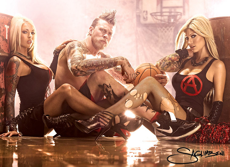
If cheerleaders looked like this, I never would have left high school.
Production Shots:
I’m terrible at shooting guys. Okay, well, maybe not terrible, but I find it much easier to direct women. Women have a range of acceptable looks to experiment with: sexy, innocent, smart, flirty, badass, adorable, etc. Men just like to look cool. And Chris “The Birdman” Andersen was definitely that.
For my shoot with Chris (and models Destiny Daniels (left) and Esther Hanuka (right)) for Rebel Ink magazine, the editor and I discussed recreating the set from Nirvana’s “Smells Like Teen Spirit” video. We got some old oil drums, a beat-to-shit muslin backdrop, my awesome intern lent me his cousin’s basketball hoop, and we soaked the concrete floor. Anyone who has a studio knows that it doesn’t take long for you to shoot out every possible angle and background, and wish you had a different studio. But this might be the best Slickforce has ever looked.
Chris was cool as hell, and his demeanor put the models at ease as well. As with nearly all mag editorials, you need a centerfold/spread. And you’d be AMAZED at how hard it is to find a centerfold pose for a guy (try it right now…see? WTF is he gonna do, lie down and arch his back?) So I was thrilled with how well this 3-shot spread came out (above). It’s one of my favorite shots of 2009, and I’m gonna get a poster up in the studio.
This shoot appears in the January 2010 issue of Rebel Ink, on stands now.
